Jun 13, 2024June 13th, 2024 · 1 minute read · tweet
The open/closed component
A powerful pattern for building extensible UI components that achieve more with less.
"The open/closed component" series
- The open/closed component (you're here)
There is a pattern that I've come to understand as a must-have for many of the UI components I build. I would dare to say it is one of the most powerful ideas I've ever encountered as a front-end developer.
I'm talking about "the open/closed component", as coined by Diego Haz (author of Ariakit), who introduced this concept in this Twitter thread.
This pattern has been silently implemented by many for a long time, and thanks to Diego, we now have a name for it. In this series, I'll explain what it is, why it's so powerful, and how to build components that follow this pattern.
Note: this article will use React in examples and explanations, but the pattern applies to most component-oriented frameworks.
Future articles in the series might go over the details of implementing the pattern in other paradigms, like Solid.js or others.
A Game of Props
The problem
If you've been in the front-end game for long enough, this situation might be familiar. Consider the following React example:
jsx
This looks fine, just one little problem... The buttons are useless! There is no way to pass a click event listener!
To fix this, let's add an onClick prop to the Button component:
jsx
That does the trick. Further down the line, you'll inevitably need other <button /> props, such as disabled, type, form, etc.
Instead of slowly adding them one by one over time as they come up, we can be smarter about it. We can collect the "custom" props like variant (through destructuring), and then pass the rest straight down to the <button /> element:
jsx
It's been pretty straightforward so far, but here's where it starts to get a bit trickier. What happens if you now pass a className prop to the Button component?
tsx
The "my-class" value -passed through {...props}- will take precedence over "primary" -passed through className={variant}.
The resolved value that's passed to the <button /> element will be "my-class", and variant="primary" will have no effect at all!
Prop spreading and precedence
Let's take a quick detour to explain what happens when you pass the same prop (like className) multiple times to a component, including as part of prop spreading (e.g. <div {...props} />).
If you already understand these concepts, feel free to skip ahead.
Passing props to a component results in the same behavior as declaring properties in an object.
That's no coincidence: when the JSX source gets compiled into JavaScript, props are compiled into actual objects! Consider this example:
jsxThat JSX component will be typically compiled into something like this:
jsxIn both cases,
propAwill be resolved with a value of"second", since it comes last and overrides any previous props/properties with the same key. If we de-duplicate the keys and leave the final values, we get:jsxWhen spreading, it's no different. The spread syntax for props and properties is simply syntax sugar for passing multiple key-value pairs at once. Consider the following:
jsxIf we "flatten" the spreads into simple props, we get:
tsxWhich in turn, de-duplicates to:
jsx
Of course, we don't want variant="primary" to be ignored, we need our variant class to be set. We could try inverting the order, like this:
jsx
However, that doesn't fix anything, it simply switches the problem around. Now, the variant class will take precedence, and the incoming className prop will be ignored.
The solution
Since multiple CSS classes can be applied to an element, we can simply merge all values together:
jsx
Note how we're still passing className twice (once through the spread, and once explicitly). This is fine as long as the merged version is last, as it will take precedence.
We can go further, and merge other props as well, like event handlers:
jsx
Note that these two examples are simplified and incomplete. I go into a lot more detail on these topics in the next part of the series.
This strategy is great, but we can't merge every prop. The amount of props that can be merged is actually rather small: className, style, ref, and event handlers.
While we can't merge non-mergeable props (duh!), we can let external props override the internal ones. With this approach, the values passed internally can be thought of as "defaults" for the underlying element or component. Defaults that the user can override if needed.
What is an open/closed component?
The approach to handling props outlined in the previous example is a part of building an open/closed component.
Here's how Diego defined it:
The open/closed (...) component:
A component that is based on the open/closed principle, which states that "software entities (classes, modules, functions, etc.) should be open for extension, but closed for modification".
Let's digest this:
- The component is closed for modification, meaning that you can't change the component itself. You can't edit its source code to adapt it to your needs!
- The component is open for extension, meaning that you can extend it without changing its implementation.
This is a critical point to understand. As Diego put it:
A component is closed for modification when you don't need to update its source code to extend its functionality.
It's not just that you can't update the source code, it's that you don't need to.
Sprinkles on top
Native HTML elements are great examples of the open/closed principle in action. You can't alter their core functionality, but you can enhance them with attributes and event listeners to suit your needs.
This concept also applies when you develop your components. By designing components that don't obscure the underlying elements, you allow users to access both the native capabilities and any custom features you've added.
For example, if you create a custom button, users can interact with both the button's native functionality (e.g. onClick) and any additional features you've designed (e.g. variant).

By following the open/closed principle, more components can be created on top of existing components, forming a hierarchy of components that build on each other.
If this sounds familiar, that's because it's just good old object-oriented programming! The open/closed principle is an OOP concept.
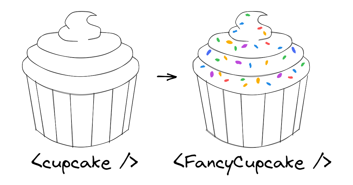
A way I like to think about this is that you're taking a native element or component, and adding a few sprinkles of functionality (or aesthetics) on top of it.
When inheritance enables composition
In component-oriented UI frameworks like React and Solid.js, a recommended best practice is to use composition instead of inheritance.
Open/closed components seem to contradict this advice: they inherit and extend the behavior and API of a different element or component. Ironically though, building components this way enables advanced composition patterns.
Notably, it enables the "render as" pattern (also known by nerds like me as "polymorphism"), which consists of rendering a component as a different element or component. Many UI component libraries support this, though the exact implementation and API varies.
The (infamous) as prop is probably the most known, and Radix's asChild approach is also fairly well-known, but for the following examples, I'll use the render prop from Ariakit.
jsx
The example above will render MyButton -including its custom styles and behavior- as an <a> HTML element (instead of the default <button>) that links to my blog. We can also do this with a component:
jsx
In this case, MyTab will be rendered as a Link (here, Link could be a framework-specific component that handles routing, e.g. in Next.js).
It's important to understand what we mean by "rendered as", so let's break it down:
MyTabrenders a<button>element by default. It passes it a few props, likeclassNamefor styling.Linkrenders an<a>element under the hood, and passes it a few props as well. For example, to handle client-side routing, it passes anonClickhandler. It also passes thehrefprop down to<a>.

When we make MyTab "render as" a Link, the props that it would pass to <button> (like className) are now passed to Link instead. In this way, a "chain" of components is created where props flow down until they ultimately reach the underlying HTML element.

Note how Link forwards the className prop down to <a>. If this wasn't the case, then the MyTab component would lose its appearance!

This is because MyTab has an HTML-element-shaped "hole". By default, that hole is filled with a <button>, but it can be filled with anything else that behaves like an HTML element.
How does an HTML element behave then? Among other things, it accepts CSS classes that are reflected in the HTML document tree.
If className is ignored by Link, then we can't say it behaves like an HTML element. That's why this last example would break!
The pieces fit
To ensure that the "render as" feature works smoothly, Radix has a couple of rules, including "Your component must spread props". Similarly, Ariakit indicates that "Custom components must be open for extension", which can be broken down into a few rules including "Spread all props (...)".
In other words, the components must be open/closed! These two libraries (as well as many others) have HTML-element-shaped holes everywhere, and all of their components are designed to be open/closed and fit into those holes.
This unlocks amazing composition patterns like the following example from the Radix docs:
jsx
Since Ariakit components are open/closed too, we can easily mix and match components from both libraries without any issues!
Below, I've rewritten the example replacing the Radix tooltip and the custom button with Ariakit components.
jsx
Here's a live demo of Radix and Ariakit working together:
Both Radix and Ariakit are fairly low-level, so they can be a little verbose. In your own component library, with the right abstractions, composition can become even simpler!
This is a real example from a component library I built in the past:
jsx
In this snippet, we have a button that acts as a menu trigger and a tooltip trigger. It renders as a single <button> element but has the behavior of all three components.
In conclusion, with the powerful "render as" pattern, we can mix:
- HTML elements.
- UI primitives from different libraries.
- Custom components that extend HTML elements.
- Custom components that extend UI primitives.
And none of it would be possible without open/closed components!
Enough philosophy for now, let's learn how to build these in the next article! (coming soon)
"The open/closed component" series
- The open/closed component (you're here)